Characters

Character design is an exercise in stress, frustration, and paranoia.
You’re starting from nothing. There’s no reason to do what you’re doing. Why did you pick those colors, that personality, that backstory? Why does this one Frankenstein’s monster of hair color, skin tone, facial features, and character traits deserve a role in your story when there are so many other options?
You just have to accept it. There are a million other ways this person could look, sound, or act, but you picked this one. So own it.
![[screaming internally] [screaming internally]](http://www.anyapalkowski.com/wp-content/uploads/2015/04/Liat_blink1.gif)
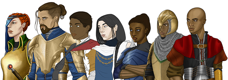
I could talk forever about the grab bag of thoughts that have crossed my mind while doing these portraits (read: why do ears look like that, everyone should have freckles, and fuck chainmail), but neither of us have infinite time, so I’ll pick a few and stick to them.
Pick a style that you aren’t going to hate after the first five drawings. At this rate I’m looking at no fewer than 30 unique portraits, all of which will need separate right-facing variants if they have asymmetrical designs (see protagonist’s sick eyepatch, pilfered directly from Fire Emblem’s Nailah, because god damn what an amazing design).
Keep your design goal in mind. In my case, these portraits are supposed to make cutscenes interesting to watch and help break up the monotony of moving around little chess pieces on a pixellated floor plan. This keeps me focused on picking interesting, nearly oversaturated colors that contrast with a monochromatic UI and should remain interesting to look at no matter which combination of characters is on screen.
Keep comparing your work against itself. You can’t just go crazy drawing whatever you feel like, because everyone does eventually need to look like they came from the same game. Following an upsetting discovery that most of my units, when stacked next to each other, had the most whacked-out distribution of proportions and limb sizes, here is a truncated example of the system I use to make sure everyone stays relatively standardized:

Side note: if you’re depressed about the state of storytelling in your chosen medium, try your hand at character design. Like many others, I’m incredibly disappointed by the way games are obsessed with telling a single story about people they don’t care to understand – women (she’s in titty armor but hey at least she’s “feisty”), black people (funk and/or thuggery through the roof), queer-identifying people (that flamboyant villain is hitting on me, ew ew ew), ad infinitum – so it was really nice to be able to make characters on my own terms. (… so of course, I made my protagonist an attractive redhead – possibly the most overrepresented phenotype in the subcategory of “women in games.” The idiocy is not lost on me.)
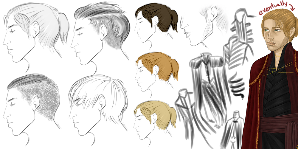
One more. I concept waaaay less than I should, and usually just go into an empty canvas, slap some colors down, and let things happen (which, unfortunately, often means recreating whatever good-looking actor is lingering in my brain after the last movie I watched). But on the occasion that I am genuinely baffled and have no idea what to do, this is what my concepting process looks like.

After all that touchy-feely nebulous “art” stuff is done, what’s left is implementing it in a way that actually contributes to the experience we want to create. That means exporting them in a sprite sheet that plays well with the dialogue system and allows different expressions to be pulled up to correspond with different lines of dialogue.
This results in some very strange-looking sprite sheets.
![]()
Our latest roadblock is a stumper. Packaging emotions into a neat little sprite sheet and stitching them together behind the curtain sounds nice on paper, but what happens when you have different screen sizes and resolutions playing pixel tetris and coming up with different ways of rendering the exact same image?

Someone get this woman a scarf to hide that gnarly decapitation scar.
BACK TO ANIMATIONS | FORWARD TO MAPS & TILES
All images on this page © 2014 Anya Palkowski. All rights reserved worldwide.