Animations

I’d like to say that this is a legit dev diary from an established indie studio with funding and staff and an open office with hardwood floors in Dumbo. I’d also like to say the visual style of Some TRPG (Working Title) is the result of months of flowcharts, diagrams, concepts, and focus groups. But the truth is that my friend and I really wanted to make a game, realized we had all the tools we needed, and were super unbelievably excited to just get something on paper and run with it. So here’s some stuff!

Some TRPG will be a grid-based, turn-based, tactical role-playing game. Imagine a game of chess, only there are bright colors and interactive environments and all the pieces have personalities, backstories, and (hopefully) interesting internal struggles. The fate of the world may or may not hang in the balance. See Fire Emblem, Final Fantasy Tactics, and – to a lesser extent – Valkyria Chronicles for our inspiration.
First thing I learned: animating a video game is hard. I like to draw, but it’s easy to cheat – you can fudge it with colors and effects and only ever draw the angles that are most comfortable to you. With animation, if you don’t know how to foreshorten or use perspective or approximate motion, it’s going to look wrong, and there’s nothing you can do to make it better except learn how actual human bodies work. I think it’s far and away the fastest way to learn how to draw, and I wish I’d started much, much earlier.
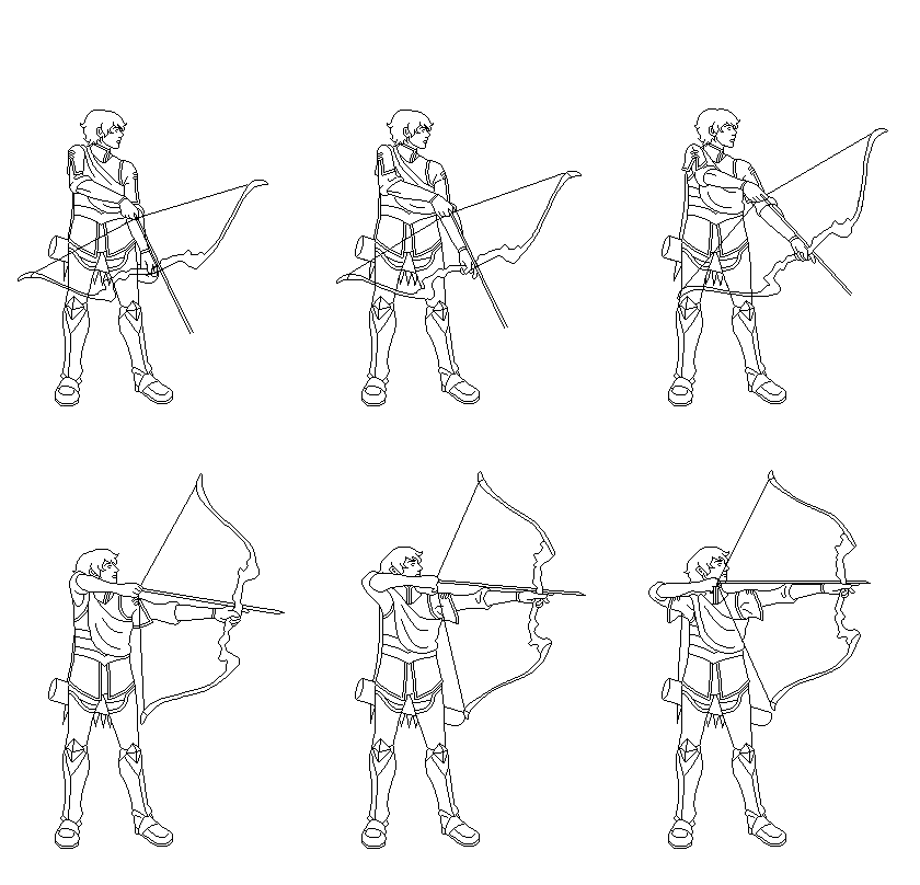
In Some TRPG, each character needs a minimum of three attack animations: up, down, and side. Characters with significant asymmetry (such as a character whose style is defined by their being left-handed) may need separate left and right-facing attack.
 |
 |
 |
Secondary attacks that allow a unit to attack from 2 or more squares also need 3 animation variants. That’s not to mention possible diagonal variants – a minimum of 2 extra animations per unit. Fire Emblem Thracia 776 did this, and it really smoothed out combat and added polish, so I’ll probably add these later.
 |
 |
 |
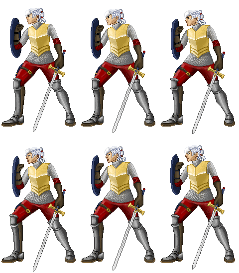
Each unit has an interactive element to their attack, during which the player can perform a mouse action (ranging from a simple click to a click-and-drag to a minigame based on timing and reflexes) that provides a strategic choice. The protagonist below has the ability to jump ahead into an enemy’s square, chess-style, and occupy their space – useful in gaining ground faster and seizing chokepoints, bad for jumping directly into a clump of enemies and leaving the safety of your blockade.

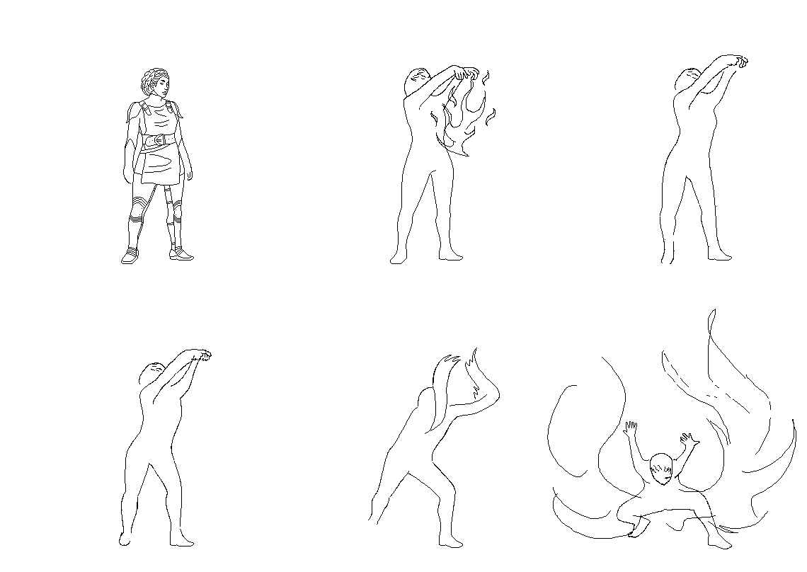
Then there’s running, dodging, and special animations like healing or *gasp* magic that vary by unit.
 |
 |
 |
 |
Plus a bunch of special-case animations for plot moments when the canned ones won’t cut it.
It’s no Stella Deus, with its facing mechanics, isometric view, and hundreds of special case animations for combo and special attacks, but it sure feels like a lot for Baby’s First Video Game. Fortunately, it’s a simply ridiculous amount of fun, and I get to film myself acting like a complete tosspot with a Swiffer handle and pot lid, so… win-win?
Bonus content: what could have been, before I realized I was putting the cart several leagues and a couple of dimensions before the horse. Detailed, King of Fighters-style animations in a Fire Emblem-like zoomed in combat environment.
 |
 |
 |
Context: the little sprites at the top take me about 8 hours per animation. The bigger ones take me weeks, and that’s just for the lineart. It’s probably obvious why we decided to shoot for the basics before adding the frills, and I’m not entirely sure I’ll even be able to incorporate these later in the project lifecyle. Oh well – what kind of world would it be if we could have everything we wanted?
BACK TO ART | FORWARD TO CHARACTERS
All images on this page © 2014 Anya Palkowski. All rights reserved worldwide.